RESEARCH & DEVELOPMENT
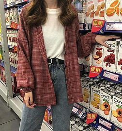
TARGET AUDIENCE - The campaign and designs will be directed at teens and young adults who have a heightened liking to fashion, specifically the themes of streetwear and retro aesthetics.
This audience is heavily based around social media so directing and making my campaign to be media friendly is a priority. To do this my designs for both clothing and advertisements will have to be clear on both a bill board and a small online post on a phone. The audience also seem to impulsively buy these types of products because of the sheer scarcity of streetway products that are on the cheaper side. I.e. not brands like Supreme, Gucci, Louis Vitton, etc...
For outdoor advertising, putting my campaigns in areas that have high concentrations of the target audience would be prime. Locations such as near thrift shops, busy walkways and maybe near already established brands are optimal.
AESTHETICS - Aesthetics is a branch of philosophy that deals with the nature of beauty and taste, as well as the philosophy of art. It examines subjective, sensory and emotional values, or sometimes called judgments of sentiment and taste.
Aesthetics in fashion is an expressive art form that deals with certain clothing designs, pictures, items, etc… and puts them into categories.
There are many aesthetics that people choose to like and dislike. It isn’t really known when people decided to look back on history and choose artistical parts about it and try to reciprocate it into the modern times. Take the example of the Renaissance and Greek mythology, some like it, some don’t like it and some people don’t care about it.
A more modern example of aesthetics in fashion is the “retro aesthetic” where people dress and buy things that are or look like they are from the 80s / 90s. This aesthetic is one of the most popular ones right now as of 11/01/21. People are combining it with modern fashion and creating whole new sub-divisions of the retro aesthetic.
Another modern example of aesthetics in fashion would be the “grunge” aesthetic. This is where people focus around dark colours, mainly black and grey, and are obsessed with skulls and other things considered “edgy” or to the untrained eye, “emo”.
An aesthetic I would like to explore is space and its associated elements.
Fashion brands are like a trend, they will become hot and slowly fizzle away into nothing again. Like a star!

ART - Renaissance. Both the art and the period of time, this is where modern art and design flourished and, in my opinion, the golden age of art. Through the 15th century into the 16th, Renaissance was at its peak and had gathered the name of the “high Renaissance”. This movement was all about the concept of Roman humanitas and the rediscovery of classical Greek philosophy, such as that of Protagoras. This new thinking spread into every aspect of the forefront of humanity: in art, architecture, politics, science and literature. Early examples were the development of perspective in oil painting and the revived knowledge of how to make concrete statues. As many people might tell you this art movement was the birth of the art we see today and therefore, the stepping stones leading to the birth of graphic design. I would like to focus my ideas around this time period as I find it interesting and I can get a lot of creative ideas around it.
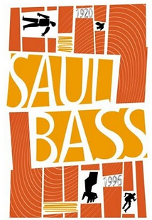
Jumping forward five centuries, Saul Bass was an American graphic designer and Oscar-winning filmmaker best known for his design of motion-picture title sequences, film posters, and corporate logos. Bass is responsible for many corporate logos such as: AT&T (1969 & 1983), Quaker Oats (1969), United Airlines (1974), US postage.

FORMS OF RESEARCH - Due to the current COVID situation, it is not possible to gather primary research from: events, exhibitions, galleries, etc...
Secondary research is reduced to only internet based.

CLOTHING
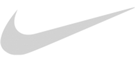
FAMOUS BRANDS - Specifically skate brands. Globe, Vans, Thrasher, Spitfire & Nike (Nike SB).
Nike being the objectively most famous of them all. Nike's official upbringing started in 1978 when it first went public. However it started before that in 1964 it was actually named Blue Ribbon Sports, they soon released the Nike brand of shoe in 1972 where it gained so much traction (both literally and metaphorically) that they company wanted to rename the entire thing as Nike. This was done in 1978.
'From the late 1980s Nike steadily expanded its business and diversified its product line through numerous acquisitions, including the shoe companies Cole Haan (1988; sold in 2012) and Converse, Inc. (2003), the sports-equipment producer Canstar Sports, Inc. (1994; later called Bauer and sold in 2008), and the athletic apparel and equipment company Umbro (2008; sold in 2012). In 1996 the company created Nike ACG (“all-conditions gear”), which markets products for extreme sports such as snowboarding and mountain biking. In the early 21st century Nike began selling sports-technology accessories, including portable heart-rate monitors and high-altitude wrist compasses.'
Brands like Thrasher and Spitfire are a lot newer than Nike but they have something interesting I'd like to focus on. Their clothing designs focus heavily around their logo and in Thrasher's case, the logo has a theme of being on fire. I'd like to use the idea of theme around my "company" (that I have dubbed "Astral") where I will focus on astronomy and mythology.
Encyclopedia Britannica. 2021. Nike, Inc. | History & Facts. [online] Available at: <https://www.britannica.com/topic/Nike-Inc> [Accessed 1 March 2021].
NAMES - I am deciding whether to name my clothing and advertisements after Latin words or name them after a Greek / Roman gods. Based on what the name is, the clothing will be inspired around it. For example, Sol means Sun so I would include symbols of the sun (ancient -> present) or I could have the bust of what the Romans thought the sun looked like if it were a person. The ideas are endless.
Possible Latin words: (more can be added)
- Sol
- Solaire
- Stella
- Astral
- Terra
- Luna
- Ignis
Possible Greek / Roman god names: (more can be added)
- Zeus
- Hermes
- Apollo
- Artemis
- Athena
- Vulcan
- Saturn
LOGOS - A logo is a graphic mark, emblem, or symbol used to aid and promote public identification and recognition. It may be of an abstract or figurative design or include the text of the name it represents as in a wordmark.
The history of logos is not within logos itself but within each individual logo as each one has a background and story. Some infamous logos include: Apple, Nike, Mickey Mouse and Chanel. Just to name a few.
Perhaps the most recognisable from the list being Chanel with the two interlocking C’s, representing the founder CoCo Chanel. Although there is speculation that the love of her life was also referenced in the logo being “Capel & Chanel”. The history of the logo and where it was created are wrapped in mystery but we do know its official start of life was 1925 and since then it hasn’t been changed. Speculation suggests that the logo was created as an influence of many things that Chanel used to see often. As the symbol can be found in Château Crémat castle located in Nice, which Chanel used to visit. There also is a theory including Aubazine chapel, as Chanel comes from cloister orphanage.
The Nike logo is yet another one of the most infamous logos with a very humble beginning. In 1971, a student named Carolyn Davidson was short on money for her graphic design course. A man named Phil Knight approached her with a job opportunity, as his company “Blue Ribbon Sports” had decided to launch a new football shoe named “Nike”. Carolyn accepted the offer and got to work, within 17 hours she had returned with a logo. She wanted to create motion within design hence why the Swoosh is in place with italic text. The Swoosh was established and Carolyn was paid $35 for her efforts. Little did Carolyn or Phil know that the brand is now a multi-billion dollar business and its logo was only made for the large sum of $35.

_-_Musei_Capit.jpg)
By Unknown artist - User:Jean-Pol GRANDMONT (2011), CC BY 3.0, https://commons.wikimedia.org/w/index.php?curid=26280451
LOGO DEVELOPMENT

1

2

6

10

3

4

5

7

8

9

11
THOUGHTS - I decided that design no.4 is the best as it encapsulates the theme of space with the addition of stars and it shows the name clearly. My family also agree with me. However, design 8 was chosen by some of my friends but, in my opinion, I feel that 4 is a more unique logo.
CLOTHING DEVELOPMENT

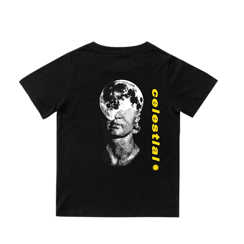
I successfully used Adobe Photoshop & Adobe Illustrator to create these images. I am happy with the results and plan to use both forms of software in production.
ADVERTISING
HISTORY OF ADVERTISEMENTS - The very first recorded evidence of an actual advert was in 2000 BC by ancient Egyptians' steel carvings. The first print advert was made in 1472 by 'William Caxton' to advertise his book. Go forward a few hundred years and we see the first news paper advert publish in in 1704 in the US. Then the first billboard advert appeared, also in the US, that displayed a circus poster on a 50 sq. ft. board.
The golden age of advertising is said to be from 1900s to the 1990s where adverts became more personalised due to radio and television becoming a new way to talk to people rather than a poster. In the 1930s an idea was proposed about a USP (Unique Selling Proposition) where your business' product will solve a customers issue. It wasn't until 1941 when the first ever television advertisement was held on America's WNBT. This single advertisement set the president for the next 70 years. Nearing the end of the 20th century many companies started using characters to build an identity for the brand such as 'Tony the Tiger for Frosted Flakes, or the Snap, Crackle, and Pop gnomes for Rice Krispies. Both of which are still seen on cereal boxes today.'
In 1992, internet usage took off as many people were using it for personal reasons. Companies saw this and 'began shifting their attention to more digital ads, starting with display advertising.'
Today we still see posters and less commonly billboards but there are now many different digital adverts; ranging from the standard television adverts all the way to user generated content where 'consumers have become a part of advertising, rather than just passive onlookers. Consumers are much more likely to spread their feelings over social media these days. They also communicate with one other far more than any ad campaign can communicate with them. For example, when evaluating a purchase, people often turn to friends and social networks to get additional opinions. That’s why it’s so important to build a community around your brand.'
Instapage.com. 2021. The Evolution of Advertising & How Personalization Improved Over Time. [online] Available at: <https://instapage.com/blog/evolution-of-advertising> [Accessed 9 March 2021].
TYPES OF ADVERTISING
-
Paid search advertising involves bidding on keywords so that advertisements related to specific keywords are placed at the top of the search engine results page.
-
Social media advertising serves promotions via social media platforms. When advertising on social media, it's important to choose your platforms wisely and recognize that not everyone in your audience uses every platform. For example, your audience on Instagram is likely to differ from your audience on LinkedIn. A post on the "official" Instagram page for my brand or a paid promotion from a high profile influencer, on Instagram, that my target audience follow.
-
Native advertising is an advert that appears as an almost-perfect match to the content that surrounds it, native advertisements come in the form of articles or videos on websites that are already hosting similar materials.
-
Display advertising. In style and format, display advertisements are unmistakably selling you something. The obvious nature of display ads is a unique factor within the field of digital advertising, since ads are typically implemented subtly. Display advertisements can be designed to be animated or stagnant, and are typically found along the top or sides of web pages. A simple website advert on any major clothing sites, for example ASOS.
-
Print advertising. While the field of advertising has evolved, the goals have remained the same: to influence the opinions and buying decisions of consumers. Advertising through print media was once the dominant form of advertising. Today, it exists among the millions of digital advertisements and it's just as important.
-
Broadcast advertising is sharing promotional messages about your product or service via television or radio.
-
Outdoor advertising, otherwise known as out-of-home advertising (OOH), is simply any advertisement made visible to a consumer outside of their home. Implementing graphic design into outdoor advertising is critical. Think about how quickly people pass by a billboard design. In the few seconds that a driver has to see it, the message has to be read and understood. Piccadilly Circus in London for the OOH form of advertising.
Goorevich, E., 2021. 7 Types of Advertising (+How They're Used). [online] Learn.g2.com. Available at: <https://learn.g2.com/types-of-advertising> [Accessed 12 March 2021].
WHAT IS AN ADVERTISING CAMPAIGN - an organized course of action to promote a product or service.
Languages.oup.com. 2021. Oxford Languages and Google - English | Oxford Languages. [online] Available at: <https://languages.oup.com/google-dictionary-en/> [Accessed 9 March 2021].

OTHER CAMPAIGNS - A very popular ad campaign would be Tommy Hilfiger’s “Join The Hilfigers” collection of ads. This set of ads perfectly encapsulates the envision of the brand, that the "family" aspect is now a Hilfigers campaign signature. The brand and collection of adverts were extremely popular within the USA as its branding used a look-a-like of the American flag.

SIZING - Billboards. Since most billboards are different sizes and shapes, so we will either have to used an average figure or use a specific billboard; such as the Piccadilly Circus billboard in London or a Times Square billboard in New York.
Piccadilly Circus' sizing is stated to be '21.1 metres by 4.8 metres' at a dpi of 12. I found out my dpi measurement by going into google maps and visually seeing if it was either 15m, 50m or 60m away from a viewers eyes. At most times the billboard seems to be 20m~.
A social media post (For Instagram) has the optimal dimensions set 1080px X 1080px which makes the post have the ration of 1:1, making the post a literal square.
Standard website advertisement sizes and shapes are as follows: (in pixels, WxH)
-
250x250 - Square
-
200x200 - Small square
-
468x60 - Banner
-
728x90 - Leaderboard
-
300x250 - Inline rectangle
-
336x280 - Large rectangle
-
120x600 - Skyscraper
-
160x600 - Wide skyscraper
-
300x600 - Half page Ad
-
970x90 - Large leaderboard
-
320x50 - Mobile leaderboard
-
320x100 - Large mobile banner

Rodriguez, S., 2021. Top 10 AdWords Banner Sizes You Need To Know. [online] Disruptive Advertising. Available at: <https://www.disruptiveadvertising.com/adwords/top-10-adwords-banner-sizes-you-need-to-know/> [Accessed 4 March 2021].
ADVERTISEMENT DEVELOPMENT
BACKGROUNDS - For the main advertisements I was thinking of getting or making some space / universe images for the background portion of the images. This is to promote the idea that my brand is "out of this word" and could be compared to the beauty of the stars. However, having stars on my advertisement poses a new problem that since some stars are so small in some images they will be almost impossible to see on a small scale image (For an example, an advertisement on a phone website / app).


ADVERTISEMENT PRACTICE


NOT A REAL WEBSITE
REFLECTION
DESCRIPTION - Extensive research into many aspects of graphic design, forms of art along time and detailing advertisement effectiveness.
FEELINGS - I thoroughly enjoyed working on physical pieces of work like my logos and advertisements rather than a load of writing.
EVALUATION - My entire experience of this section of work is good. There are some parts that did not go exactly to plan, i.e. the font choice on the advertisement. However there are good parts too, like my logo work and t shirt designs.
ANALYSIS - Since I gave myself time to create a product as an idea and not a main piece, I didn't have enough time for the latter; hence why the font was not to my liking.
CONCLUSION - Typography is a whole lot more important ant than I thought. Perhaps put more effort into typography for a better looking and cleaner outcome.
ACTION PLAN - (As said in conclusion) Put more effort into typography for a better looking and cleaner outcome.
WEEK BY WEEK - My original plan was this, (25/03/20)
"12/02/21 -> Submit proposal
22/02/21 - 26/02/21 -> Construct a presentation for my campaign and start the R&D process
26/02/21 - 12/03/21 -> all R&D should be carried out here and documented
15/03/21 - 22/03/21 -> Pre-production documents (if needed)
22/03/21 - 27/03/21 -> Production
12/04/21 - 26/04/21 -> More production
03/05/21 - 14/05/21 -> Finishing touches & Evaluation w/ hand in for assessment"
Referring to my Reflection page, I am about two days of from this original plan. An interesting discovery is that my pre-production didn't last very long with me spending a day or two gathering materials to use. This is a lot shorter than what I anticipated in my plan as I seemed to expect that it would last a week maximum.