PRODUCTION: DIVINE
BILLBOARD ADVERT
TESTING / PLANNING
REVISED ACTION PLAN & TIMETABLE - Outline plans, week by week (include what you will do, how you will do it and by when) - Be realistic, manage time and account for time taken to get resources - conduct research and get feedback from others along the way
15/03/21 - 22/03/21 -> Pre-production documents (if needed) - Creation of initial design ideas.
22/03/21 - 27/03/21 -> Production - Finalisation of initial design ideas.
12/04/21 - 26/04/21 -> More production - Creating the advertisements using the designs.
03/05/21 - 14/05/21 -> Finishing touches & Evaluation w/ hand in for assessment.
13/04/21 UPDATE -> I am on track and plan to finish one advertisement per week. Meaning I should have a finished advertisements by 16/04/21, 23/04/21 and 30/04/21.
INITIAL IDEA - This is the first frontal iteration of my first clothing design. It is rather bare bones with little to no effects and, in my eyes, with poorly drawn laurel leaves. Luckily I quickly moved on from this...


INITIAL IDEA CONTINUED - This is the second frontal iteration of my first clothing design. I changed the laurel leaves to a higher quality image and added a curves effect onto the statue of David. I also changed the text to say something more unique and defining. This design is to be embroidered on the centre of the chest as it wouldn't suit being on a common position such as on left chest or right chest. Although it is an uncommon position for a design, I feel that it not only looks better but creates more pride for the wearer.


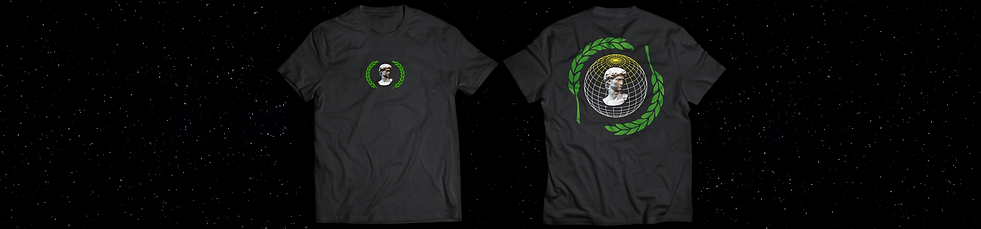
INITIAL IDEA CONTINUED - This is the first and only backside iteration of my first clothing design. I am very happy with the result as everything on it just works, apart from the location of the text or even if it needs it at all. From doing this I learnt how to actually move the centre of the gradient overlay.


FINAL PRODUCT
DAVID / DIVINE ADVERTISEMENT - This advertisement is what I wanted out of a design. It has the space theme interlaced with the historic statue of David. This design has gone through a lot of changes as I have been quite indecisive about it. However, the final product encapsulates my envision perfectly.

HOW I MADE IT

1
I first started off with a widescreen (8320x1900 at 10 dpi) canvas.


Added stars with a curves layer to make the stars brighter and space darker.
2
3
Added my t-shirt designs.

4
Added some text and the company logo.

5
To make the image more entertaining I added some wireframe globes and I added a fake website for if this ever becomes something. This is also the first rendition of the final outcome. It shows promise but I believe it is too cluttered.

6
Second rendition of the final outcome. Added symmetry and made the logo / brand have pride and place. "Astral presents ???" perhaps add what they are presenting.
7
Third and last rendition of the final outcome. Worked on the comment given and changed the colour of the text on the sides to make it easier to read.